Interactive chart in Excel 365
Highlight data series in line chart
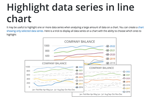
It may be useful to highlight one or more data series when analyzing a large amount of data on a chart. You can create a chart showing only selected data series. Here is a trick to display all data series on a chart with the ability to choose which ones to highlight:
How to create re-sorting chart in Excel
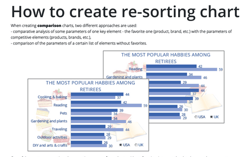
When creating comparison charts, two different approaches are used:
- comparative analysis of some parameters of one key element - the favorite one (product, brand, etc.) with the parameters of competitive elements (products, brands, etc.),
- comparison of the parameters of a certain list of elements without favorites.
- comparative analysis of some parameters of one key element - the favorite one (product, brand, etc.) with the parameters of competitive elements (products, brands, etc.),
- comparison of the parameters of a certain list of elements without favorites.
How to create interactive chart with dropdown list in Excel
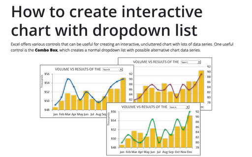
Excel offers various controls that can be useful for creating an interactive, uncluttered chart with lots of data series. One useful control is the Combo Box, which creates a normal dropdown list with possible alternative chart data series.
How to create interactive chart with checkboxes in Excel
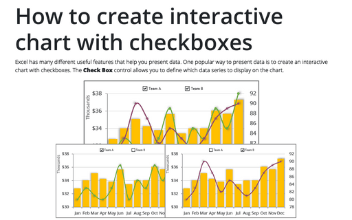
Excel has many different useful features that help you present data. One popular way to present data is to create an interactive chart with checkboxes. The Check Box control allows you to define which data series to display on the chart.
How to create interactive chart with radio or option buttons
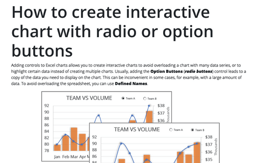
Adding controls to Excel charts allows you to create interactive charts to avoid overloading a chart with many data series, or to highlight certain data instead of creating multiple charts. Usually, adding the Option Buttons (radio buttons) control leads to a copy of the data you need to display on the chart. This can be inconvenient in some cases, for example, with a large amount of data. To avoid overloading the spreadsheet, you can use Defined Names.
How to create simple interactive chart with radio or option buttons
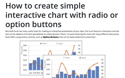
Microsoft Excel has many useful tools for creating an interactive presentation of your data. One such feature is interactive controls that can be added to the Excel spreadsheet to create dynamic charts. To avoid cluttering the chart with many different data series, Excel offers using various controls, such as Option Buttons, that can be easily added and customized.
How to create Master and Scrolled Detail charts
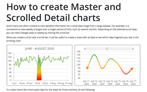
Scroll charts are often created to view detailed information for a small data range from a large dataset. For example, it is convenient to view weekly changes over a longer period of time, such as several months. Depending on the selected scroll step, you can view changes daily or weekly by moving the scroll bar.
How to create a Scrolling chart
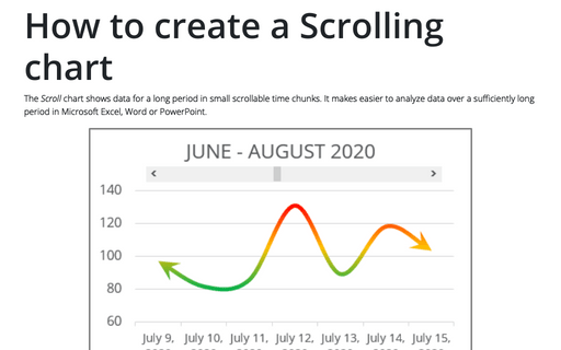
The Scroll chart shows data for a long period in small scrollable time chunks. It makes easier to analyze data over a sufficiently long period in Microsoft Excel, Word or PowerPoint.
The Scroll chart displays some contiguous range of data from a large dataset. Using the provided Control tools, it is possible to add a scroll bar to the chart area and view the desired data range:
The Scroll chart displays some contiguous range of data from a large dataset. Using the provided Control tools, it is possible to add a scroll bar to the chart area and view the desired data range:
